Page Templates

There are currently two page layout templates. Both are responsive to different screen sizes including mobile. Most components can be used on either layout.

Sideburns

The sideburn layout has a wide primary column and a narrower secondary column on either the left or right side of the page. The secondary column can contain a lead form or a call-to-action.

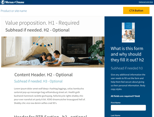
Pros: This layout maximizes space on the page - it can fit a lot of the content higher up on the page.

Cons: This layout can appear "cluttered" and "overwhelming" since so much content is visible at once.

Elements:

  • Full Width Hero
  • Primary Column
  • Side Complimentary Column
  • Body (same width as primary column)
  • 12 Wide Body
  • Full Width


Forehead

The forehead layout is a single column with a large, dramatic hero image and headline. A call-to-action and body content continues down the page in a single column.

This layout tells a singular story with a straightforward, linear progression of content.

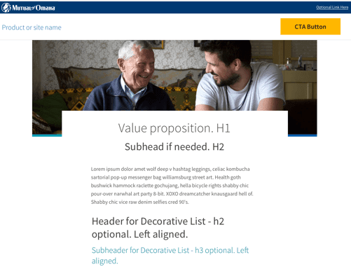
Pros: This layout can deliver its message in a very powerful way.

Cons: This layout pushes content further down on the page, so less is immediately visible to the user.

Elements:

  • Hero
  • Body
  • 12 wide Body
  • Full Width


Headers

All layouts include the same header, including the following parts:

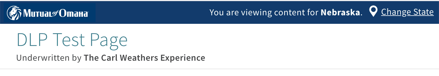
Corporate Universal headers

The blue corporate universal header contains any location service (state selector) information.

Read more about the universal corporate header

Global Header Bar and Global Logo

The white global header bar contains the appropriate company logo and any underwriting statements.

Read more about the global header bar

Elements:

  • Logo
  • Site Name
  • Call to Action
  • Nav Logo
  • Geo Location


Footers

Websites should have a footer at the bottom of each page to let users know they have reached end of the content.