The Basic Hero, also referred to as the notch hero on the single column template, has very limited data that can be input. This is a great hero for getting your imagery out there then moving quickly on to the rest of your content. You can use it in the hero block on single column or primary column block in a side-burn template.
Elements:
- Headline - Required, alterable text
- Subhead - Optional, alterable text
- Hero photo - Required, custom image


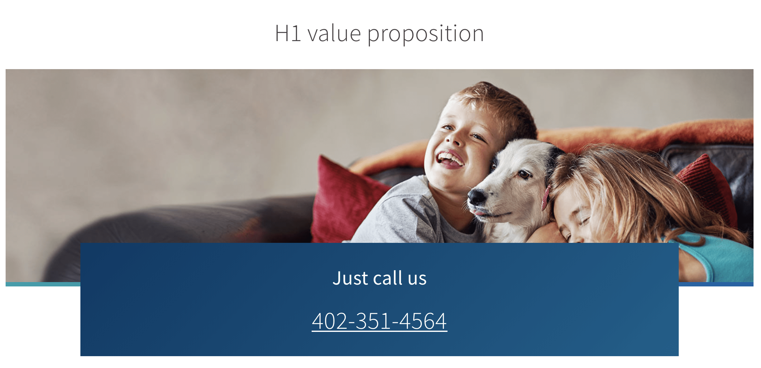
Elements:
- Headline - Required, alterable text
- Subhead - Optional, alterable text
- Hero photo - Required, custom image
- CTA Headline - Required, alterable text
- CTA Subheadline - Optional, alterable text
- CTA Supporting paragraph text - Optional, alterable text
- Button OR Phone number - MUST have one or the other (not both)
- Button - Alterable text
- Phone number - Alterable text
- CTA Small text - Optional, alterable text


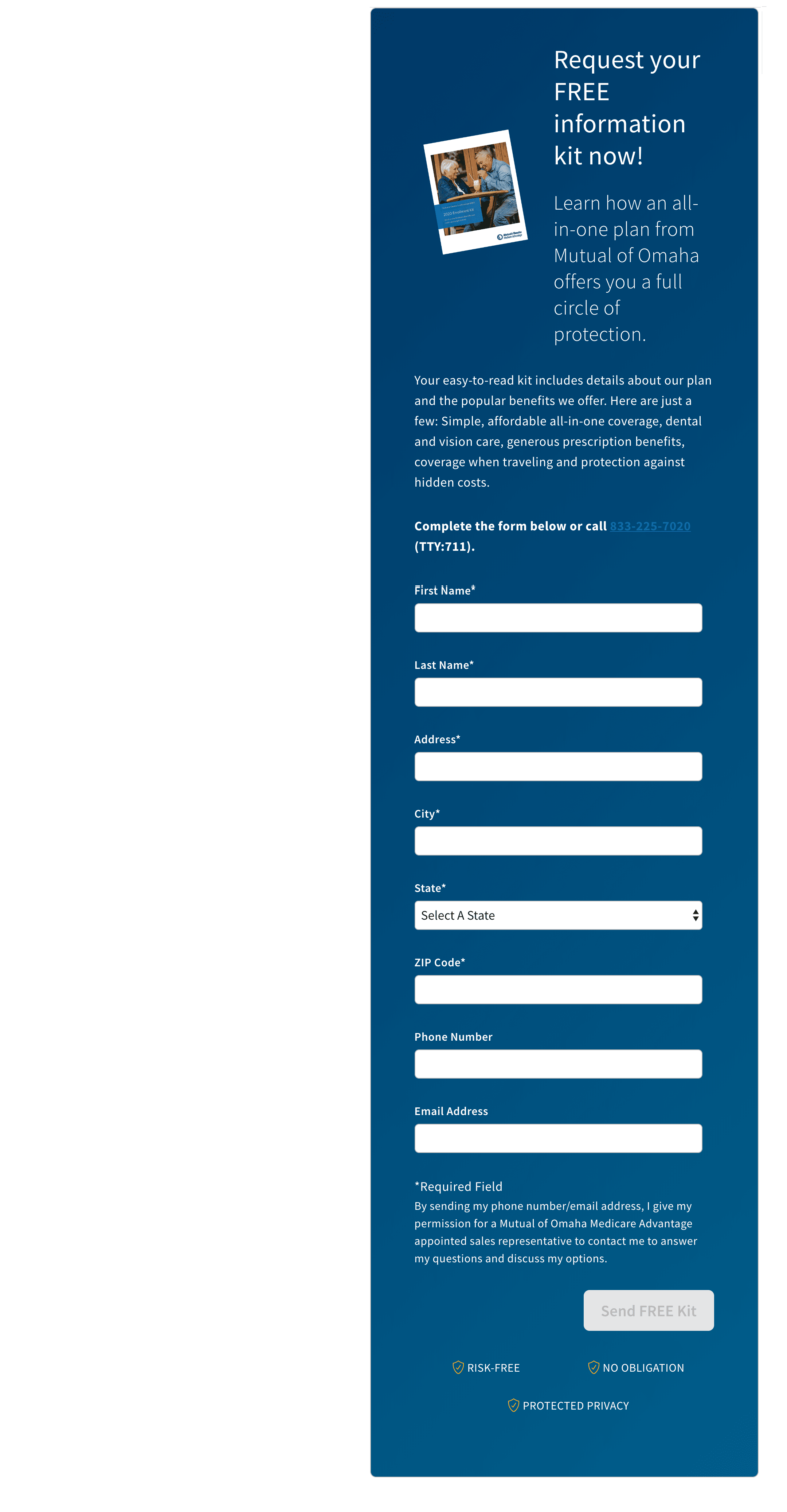
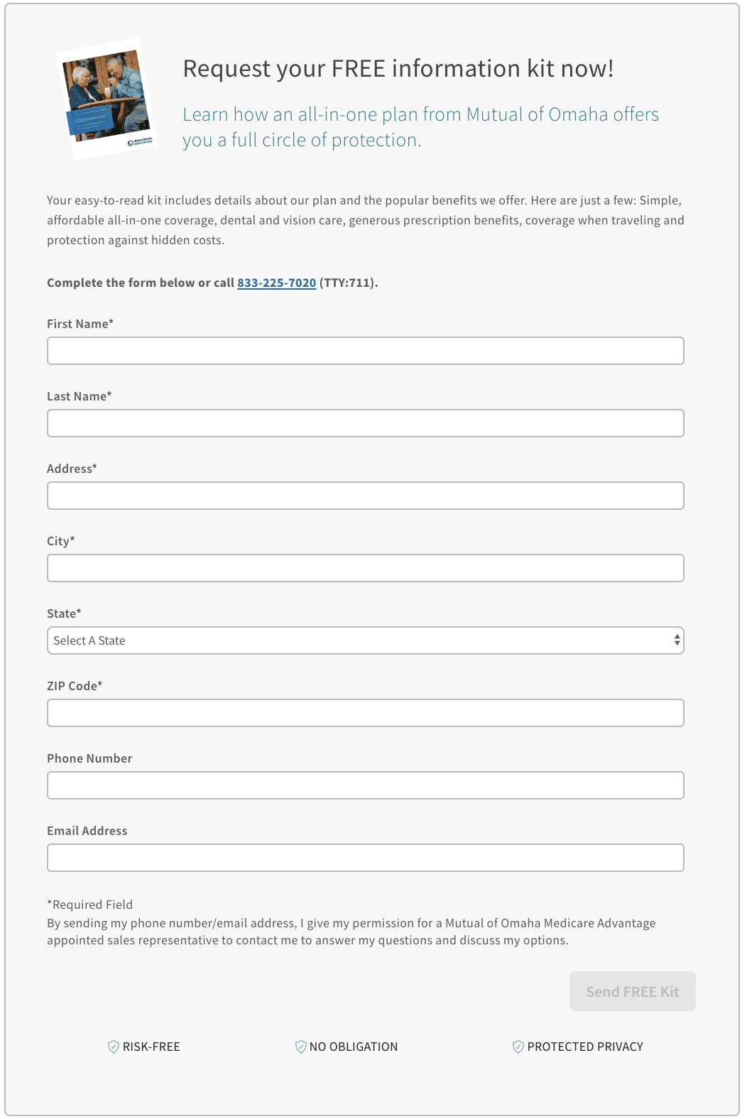
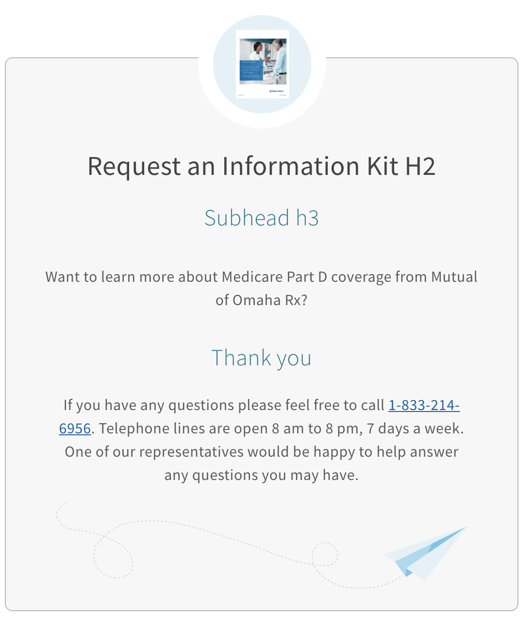
Long forms are very versatile and can be used anywhere in both the forehead and sideburn templates. There are two color variation and a few template variations available to a from. They can be inverted and are set up to work on sideburn and single column templates. If the page offers the customer incentives such as a brochure, a thumbnail image of the item being offered can be included above the form. We tend to use these pages as lead forms to collect information for telephone calls and email remarketing.
Elements:
- Thumbnail - Optional, custom image
- Headline - Required, alterable text
- Subhead - Optional, alterable text
- Paragraph Description - Optional, alterable text
- Requirements/Instructions - Optional (?), alterable text
- Fields - At least one is required
- Required Fields - First name, Last name, Address, City, State, ZIP
- Optional Fields - DOB, Email, Phone number
- Disclaimer - Optional, alterable text
- Button - Required, text is alterable
- Confidence tags - Required/Built in, not alterable
Elements:
- Illustration - Optional
- Header - Required, alterable text
- Subhead - Optional, alterable text
- Body - Optional, alterable text
- Call To Action - Required
- Support Text - Optional
- Reversed - Optional

Elements:
- Illustration - Optional
- Header - Required, alterable text
- Subhead - Optional, alterable text
- Body - Optional, alterable text
- Call To Action - Required
- Support Text - Optional
- Reversed - Optional

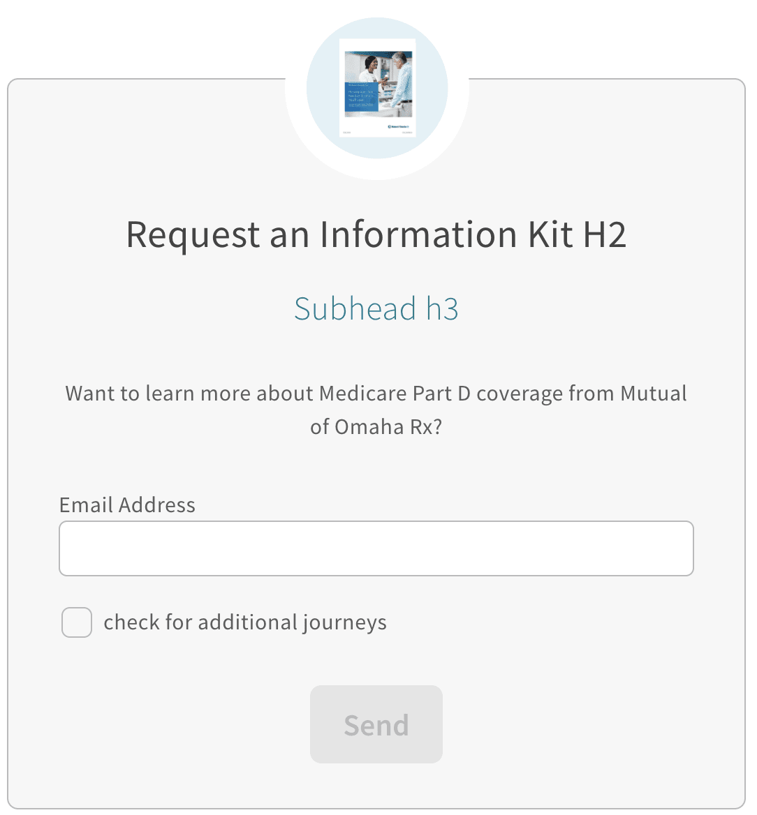
Short Form call-out box is the perfect way to capture your users email address without being intrusive. Sometimes we just need to get our user into the funnel with the intent of following up to further work that lead and this is the perfect approach.
This call out box does come with a lot of complexities. It can support campaign tracking codes, hidden inputs, server errors, thank you messages and additional information checkboxes. These things can / should be configured to get the best results out of this module. Currently it only supports interactions with Salesforce Marketing cloud but could be updated to support other API end points for more flexibility in its uses.
Elements:
- Illustration - Optional
- Header - Required, alterable text
- Subhead - Optional, alterable text
- Body - Optional, alterable text
- Call To Action - Required
- Support Text - Optional
- Reversed - Optional
- Trackers - Optional
- Thank You - Optional
- Analytics Object - Optional
- Server Error - Optional
When using tracker_hidden_input, make sure to coordinate the allowed_trackers under properties to match. Without this, the trackers won't work. We do this intentionally as to not allow the users to be malicious and pipe in query parameters.
Elements:
- Style - Optional, defaults to outline
- Header - Required, alterable text
- is_phone_number - Boolean, false for button
- Link - Required, where the button/link will take you
- tty - Optional, used for is_phone true
- Target - Optional, defaults to _self
- Content - Required, inner of button or phone number


Elements:
- Header - Required, alterable text
- Subhead - Optional, alterable text
- RTB Illustration - Required
- RTB Subhead - Optional
- RTB Description - Optional, need either subhead or description, can have both.


Elements:
- Value Prop - Optional
- Subhead - Optional, alterable text
- Content - Optional, alterable text
- Image - Required

Elements:
- Header - Optional
- Subhead - Optional, alterable text
- List Item - Required, alterable text
- Icon - Optional
- List Text - Required

Elements:
- Headline - Required, alterable text
- Description - Optional, alterable text
- Call To Action - Required, alterable text
- Reversed - Optional
- Support Text - Optional, alterable text


The below fields are a baseline of what's needed to get the Medicare Supplement quoter working. This element doesn't have a ton of customization outside of content. It's meant to exist in the 'body' section of a forehead template or the 'primary-column' or 'body' section on a sideburn template.
Tracking and Attribution
To properly function, this block does need some extra data outside of the component. For the entire DLP page, there should be a property key towards the top. This is where things like template are defined. We will need to compliment this block with two new key value pairs.
As a baseline, we should use these and then work with our marketing friends (Kelly Giese and Charles Richardson as of right now), to verify the campaign codes. Some of the below values can differ, but as a baseline, this is very safe.
MS Quote questions

MS Quote results
The existing title block is documented on the Templates Page. For more information go there.
In the near future, expect more documentation around the loaded header, which offers a button in addition to phone number for extra functionality.