Beta Components
Not all components are created equal, which isn't a bad thing, but because of this we need to have a playground for these new components and need a place to document them as well. This is that place.
The components you see here are available for use but should be reviewed with the team/person who originally published them to make sure that you're doing so correctly. These components may or may not be destined for greatness or a trash bin, plan accordingly!
Warning!!
Floating ads, also referred to as page curls, are a newer component that is utilized to add a secondary goal to the page. This helpful little snippet in the bottom corner of the page gives the user a second call to action. It is subtle, but still helpful for overall goals of the page. For example, you could have a page whose goal is to sell product A, but needs a subtle call to product B, because it's totally in season.
Elements:
- Image - Required, custom image
- Header - Optional, but encouraged
- Body - Optional, but encouraged. This is where your link would go

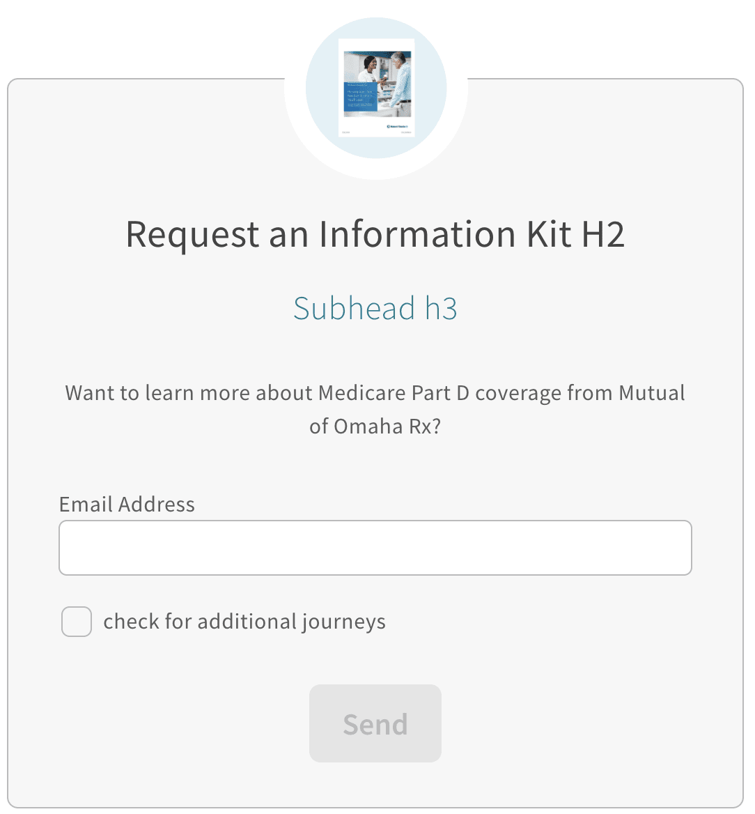
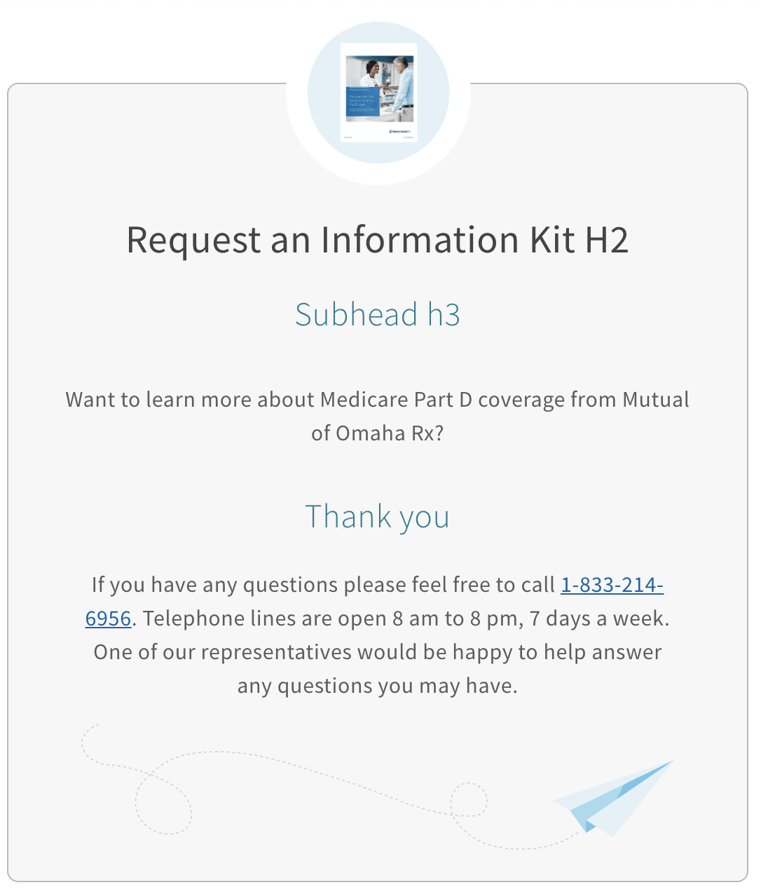
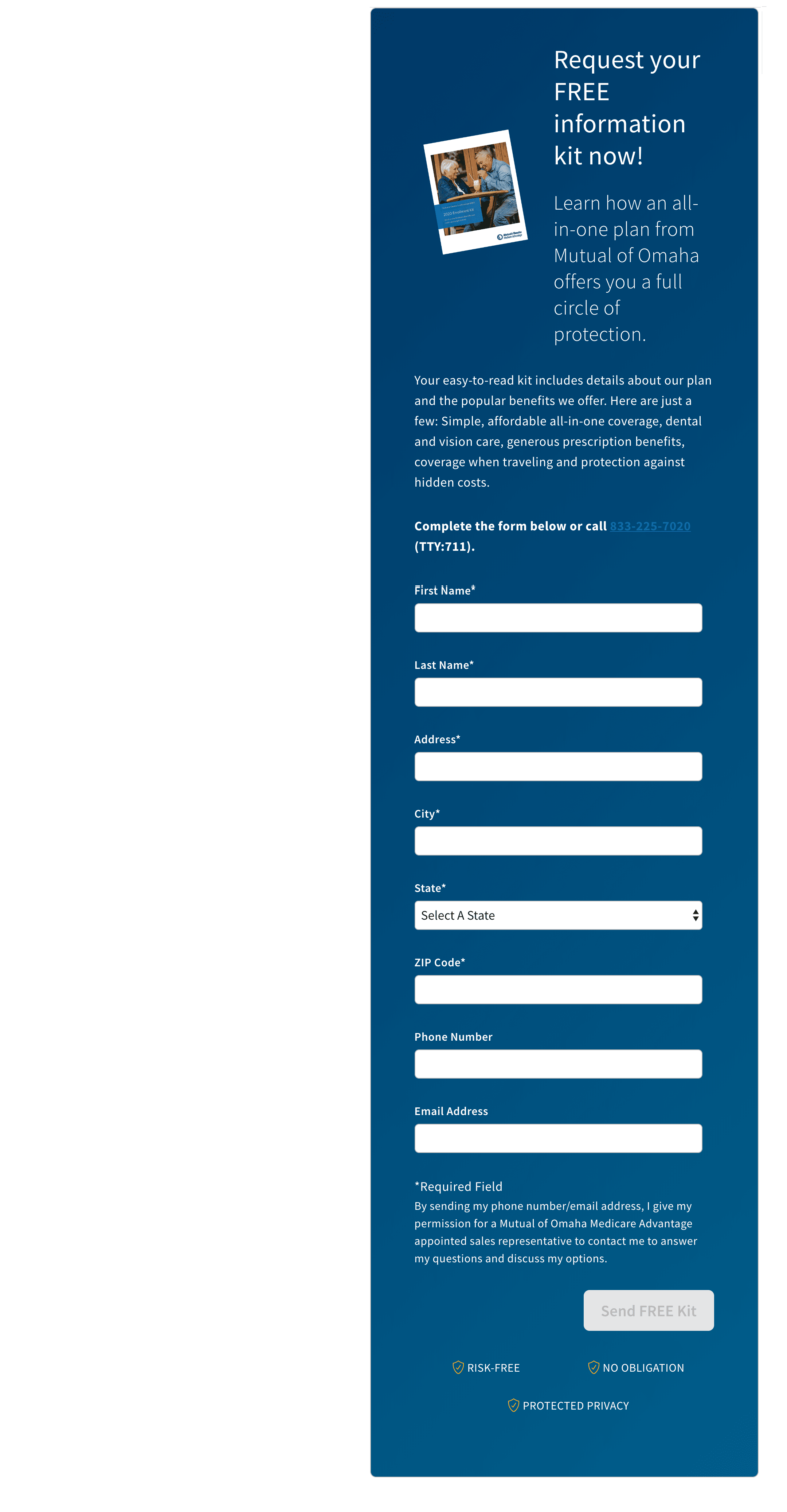
There really isn't a difference between long and short form anymore. Because of how form block v2 is constructed, you are in control. You create the fields you need, how you need them to behave and then send it on its merry way. It's significantly more powerful but also prone to human error. Test this component before you send it out in the wild!
Elements:
- Thumbnail - Optional, custom image
- Headline - Required, alterable text
- Subhead - Optional, alterable text
- Paragraph Description - Optional, alterable text
- Requirements/Instructions - Optional (?), alterable text
- Fields - At least one is required
- Required Fields - First name, Last name, Address, City, State, ZIP
- Optional Fields - DOB, Email, Phone number
- Disclaimer - Optional, alterable text
- Button - Required, text is alterable
- Confidence tags - Required/Built in, not alterable
Fields:
- allFields - Required, a list of the elements by key name, maps order of keys
- YOUR-KEY-HERE! - Type Object, Required
- content_type - Required - [input, select, zip-input, state-select, radio, checkbox]
- content.name - Required, what the field will call itself when posted
- content.required - Boolean
- content.label - Required, what will display to the user
- content.error - Required, what will display to the user
- content.dataPattern - Required, helps with validation, alphaNum, number, email, phone and more
- content.length - Optional, sets max length (for phone number as an example)
Below would be an example of what is needed to make the traditional long form work. Because this has a lot of flexibility in it, if you feel overwhelmed, reach out to a developer friend and see if they can provide clarity.
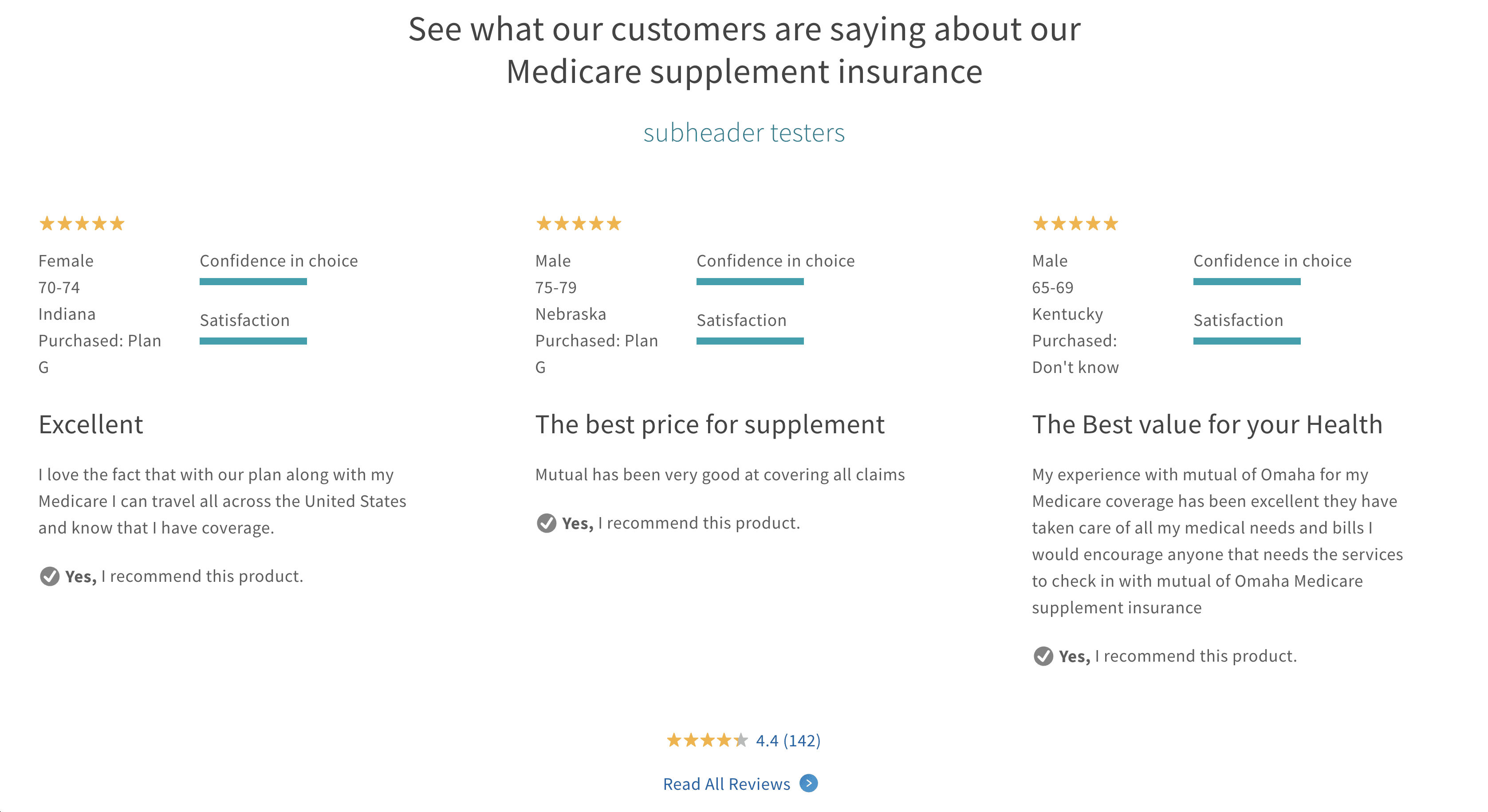
The reviews block is currently a Senior Health only component. This is a legacy component that was brought over from the main marketing pages. It finds the zip code from the page and uses it, goes off, gets a few top-rated reviews that have been approved for use, then gives our Medicare products an over-all rating also returned from the same end point returning the top reviews.
Elements:
- Header - Required
- Subhead - Optional
- All Reviews Text - Required, 'link text' after component
The related articles block can support one of three resource types: video, article, calculator. The entire article is clickable but needs a screen reader text that is meaningful to the card so that the focus makes sense.

Tealium is a tool that is used to help aggregate and clean up data then take further actions as needed.
Two new keys were added to the object, both are to support getting extra data into Tealium so a marketer can make better decisions.
Elements:
- Illustration - Optional
- Header - Required, alterable text
- Subhead - Optional, alterable text
- Body - Optional, alterable text
- Call To Action - Required
- Support Text - Optional
- Reversed - Optional
- Trackers - Optional
- Thank You - Optional
- Analytics Object - Optional
- Server Error - Optional
- sessionsVisitor_hidden_inputs - Optional
- leadAttrs_hidden_inputs - Optional
When using tracker_hidden_input, make sure to coordinate the allowed_trackers under properties to match. Without this, the trackers won't work. We do this intentionally as to not allow the users to be malicious and pipe in query parameters.