Large screen diagram

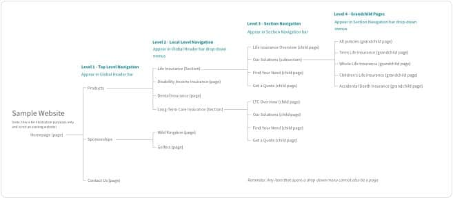
1 Universal Corporate Header Bar
Universal Corporate Header rules and usage
2 Global Header Bar
Global Header rules and usage
3 Level 1 - Top Level Navigation Item without Children
This is a clickable page
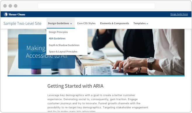
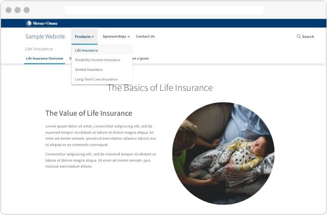
4 Level 1 - Top Level Navigation Item with Children
Label only and not a page. On-click opens drop-down
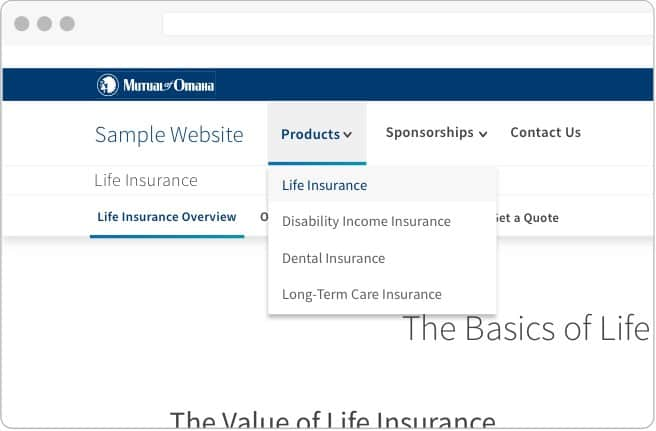
5 Level 2 - Local Level Navigation Page without Children
This is a clickable page
6 Level 2 - Section Link
Styled the same as #5. Clickable link that takes user to Child Page A
7 Level 2 - Section Title
Label only and not clickable. Matches Section Name (#6)
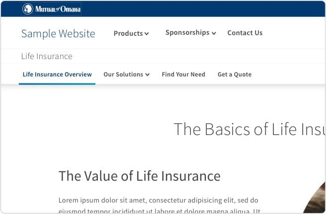
8 Level 3 - Section Navigation Bar
9 Level 3 - Child Page
This is a clickable page
10 Level 3 - Current Page
Not clickable
11 Level 3 - Section Navigation Item with Children
Label only and not a page. On-click opens drop-down
12 Level 4 - Grandchild Page
This is a clickable page
Mobile & small screen diagram


1 Universal Corporate Header Bar
Universal Corporate Header rules and usage
2 Global Header Bar
Global Header rules and usage
3 Level 1 - Top Level Navigation Item without Children
This is a clickable page
4 Level 1 - Top Level Navigation Item with Children
Label only and not a page. On-tap moves to next menu
5 Level 2 - Local Level Navigation Page without Children
This is a clickable page
6 Level 2 - Section Link
Styled the same as #5. Clickable link that takes user to Child Page A
7 Level 2 - Section Title
On-tap opens Section navigation menu. Matches Section Name (#6)
8 Level 3 - Section Navigation Bar
On-tap opens Section navigation menu. Always displays current Section title
9 Level 3 - Child Page
This is a clickable page
10 Level 3 - Current Page
Not clickable
11 Level 3 - Section Navigation Item with Children
Label only and not a page. On-tap opens dropdown
12 Level 4 - Grandchild Page
This is a clickable page
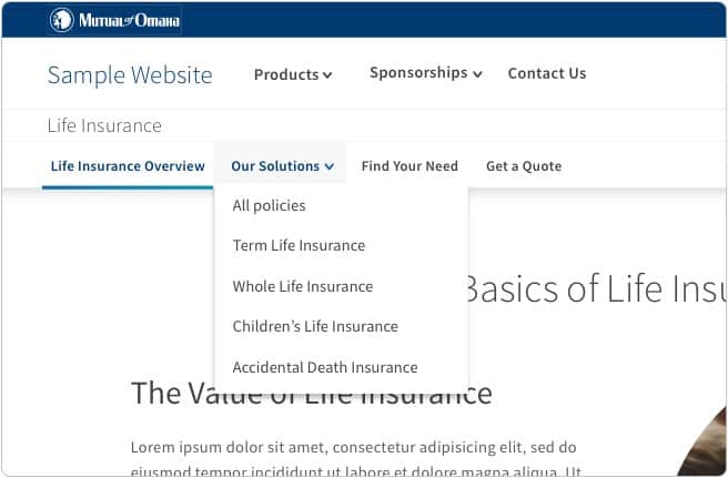
Top Level Navigation is the highest point in the site’s information architecture and is placed in the Global Header bar. The Top Level Navigation always remains consistent, even if a user has navigated deeper into a site’s structure.
Single level sites
In the case of single level sites, the Top Level Navigation is the only part of the Standard Navigation pattern necessary. When clicked, Top Level Naviagtion items go directly to their respective pages.
Helpful hints

Local Level Navigation makes up the second level of the information architecture. This level can include pages and/or Sections that are exposed through the use of a drop-down menu.
A Section is any item in the drop-down menu that has pages below it in the information architecture. See more about Sections below.
A page is a link in a drop-down menu that goes directly to a page and has no child pages below it in the information architecture.
To meet ADA requirements, the drop-down menu must open on-click, not on-hover. This means that any Top Level Navigation item with pages below it cannot also be a page. These instead act as a label for the Local Level Navigation pages that are exposed in the drop down.
If there is a mix of Top Level Navigation items that go directly to a page and items that open a drop-down, use a caret to indicate the difference in functionality. If the styles are not mixed, no caret is necessary.
Helpful hints
Section overview
As a site’s architecture stretches to 3 or 4 levels deep, Sections begin to play a role in its structure. A Section is any Local Level Navigation item (level 2 in the information architecture) with pages below it. Pages and Sections are styled identically in the drop-down menu.
When a Section is selected from the drop-down menu, the user is navigated to the first child page of the Section.
If there are fewer than 3 levels of navigation Section Titles and Section Navigation are not used.
Helpful hints
Section titles
The Section Title should mirror its label in the dropdown menu. On large screen devices, the Section Title is placed on the top of the page below the Top Level Navigation and above the Section Navigation bar. On mobile and small screen devices, the Section Title houses the Section Navigation in a drop-down menu.
The section navigation bar
The third level of information architecture appears in the Section Navigation bar, directly under the Section Title. On mobile devices, the Section Navigation moves into the Section Title’s drop-down menu.
On large screen devices, the Section Navigation bar can house a call to action. This call to action should be moved to either the page content or to another area of the screen on small and mobile devices.

Child pages & subsections
Section Navigation bar items can be either pages - Child pages - or subsections with pages below them. Similar to the Top Level Navigation, any Section Navigation item that has pages below it cannot be a page itself, and acts as a subsection label.
The Section Navigation bar is persistent, and does not change if the user navigates deeper into a subnavigation drop-down menu. It only changes if the user moves to a completely different Section.
Level 4 - grandchild pages
The fourth level is the lowest tier of navigation supported in the Standard Navigation pattern’s information architecture. All items in this level are considered “grandchild pages” and cannot have any pages below them. Grandchild pages are located in a Section Navigation drop-down menu.
Helpful hints
The lowest level of navigation available remains sticky upon scroll. Upon scrolling up, the other levels become visible with the exception of the blue Universal Corporate Header Bar.
The Universal Corporate bar does not become sticky unless it has frequently used links or other imporant features in it.

Our coded navigation templates include the necessary ARIA tags for accessibility. For general information about menu and menubar accessibility, see the W3C’s documentation.
Ready to start developing a Standard Navigation header? See the Templates section for coded examples and developer’s documentation.