Large screen diagram

1 Universal Corporate Header Bar
2 Mutual of Omaha Logo
3 Universal Link(s)
4 Global Header bar
Mobile & small screen diagram

1 Universal Corporate Header Bar
2 Mutual of Omaha Logo
3 Universal Link(s)
4 Global Header bar
Using the universal corporate header bar
The Universal Corporate Header is the blue bar at the top of the page. It is intended to connect a site to the corporate brand. This area can house links to other universal navigation and elements such as a state selector or a link back to a parent site from a landing page.
The Universal Corporate Header Bar’s purpose is to brand the site while allowing the site’s title to be the primary name on the page. For this reason, do not use it without the Global Header Bar (see the Global Header Bar documentation below).

Large screen diagram

1 Universal Corporate Header Bar
2 Global Header Bar
3 Site or Application Name4 Top Level Navigation Page
5 Top Level Navigation Drop-down
6 Utility Item
Mobile & small screen diagram

1 Universal Corporate Header Bar
2 Global Header Bar
3 Site or Application Name4 Top Level Navigation Page
5 Top Level Navigation Drop-down
6 Utility Item
Using the global header bar
Utility items (ex. account login, search, tools, etc.) can also be placed in the Global Header Bar on the right-hand side.
A basic call to action that applies to the entire site (ex. a phone number on a marketing landing page) can be placed in the right-hand side of the Global Header Bar, space permitting.

Global header logo options
If a site or application does not have a title (ex. mutualofomaha.com), the blue primary logo is placed in the Global Header Bar area, and the white reversed logo in the blue Universal Corporate Header bar is removed.
The Digital Design System offers several navigation patterns to fit a range of scenarios. The chart below details the strengths for each type of navigation pattern.
Helpful hints
Types of navigation patterns
Standard navigation
A top horizontal navigation with drop-down menus. Supports up to 4 layers of navigation.
Standard Navigation pattern details
Mega menu navigation
A top horizontal navigation with a mega menu. Supports up to 4 layers of navigation.
Left side navigation
A vertical navigation menu which sits on the left side of the page. Supports up to 5 layers of navigation.
The left nav is currently a work in progress.
Navigation pattern comparison
| Attributes | Standard Navigation | Mega Menu Navigation | Left Side Navigation |
|---|---|---|---|
| Supports single level sites | |||
| Supports multi-level sites | |||
| Supports content-heavy sites and applications (more than 4 levels of navigation) | |||
| Supports sites with many top-level navigation items | |||
| Supports featured content in the menu | |||
| Ideal for online applications | |||
| Ideal for microsites and landing pages | |||
| Ideal for marketing sites | |||
| Supports mobile and desktop |
The hero is a marketing element designed to add visual interest to a page. It includes an image and a blue box with a headline. The hero always sits at the top of the page, below all navigation bars.
Heroes are not required. Because of their large size, pages where the user needs to get to content quickly should avoid using heroes.
Helpful hints
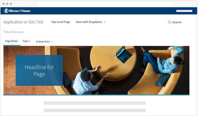
Headlines are written in sentence form and give the user a clear understanding of the purpose of the current page. The headline can appear in the blue box on a hero image or with the page content.
Headlines are generally an h1 tag. To keep our sites optimized for search engines, every page should only have one h1.
Helpful hints
