Large screen diagrams

1 Universal Corporate Header Bar
Universal Corporate Header rules and usage
2 Global Header Bar
Global Header rules and usage
3 Level 1 - Top Level Navigation Item with Children
Opens mega menu
4 Level 1 - Top Level Navigation Item without Children
Clickable page
5 Level 2 - Grouping Title
Labels a collection of navigation items in the mega menu. Not clickable
6 Level 2 - Local Level Navigation page without Children
Clickable page
7 Level 2 - Local Level Navigation Section
Styled the same as #6. Links to the Section’s first child page

1 Universal Corporate Header Bar
Universal Corporate Header rules and usage
2 Global Header Bar
Global Header rules and usage
3 Level 1 - Top Level Navigation Item with Children
Opens mega menu
4 Level 1 - Top Level Navigation Item without Children
Clickable page
5 Level 2 - Grouping Title
Not shown. See previous diagram
6 Level 2 - Local Level Navigation page without Children
Not shown. See previous diagram
7 Level 2 - Local Level Navigation Section
Not shown. See previous diagram
8 Level 2 - Section Title
Label only and not clickable. Matches Section Name (#7 on previous diagram)
9 Level 3 - Section Navigation Bar
10 Level 3 - Child Page
This is a clickable page
11 Level 3 - Current Page
Not clickable
12 Level 3 - Section Navigation Item with Children
Label only and not a page. On-click opens drop-down
13 Level 4 - Grandchild Page
Clickable page
Mobile & small screen diagrams


1 Universal Corporate Header Bar
Universal Corporate Header rules and usage
2 Global Header Bar
Global Header rules and usage
3 Level 1 - Top Level Navigation Item with Children
Label only and not a page. On-tap moves to next menu
4 Level 1 - Top Level Navigation Item without Children
On-tap goes to page
5 Level 2 - Grouping Title
Labels a collection of navigation items in the menu. Not interactive
6 Level 2 - Local Level Navigation page without Children
On-tap goes to page
7 Level 2 - Local Level Navigation Section
Styled the same as #6. Links to the Section’s first child page
8 Level 2 - Section Title
On-tap opens Section navigation menu. Matches Section Name (#7)
9 Level 3 - Section Navigation Bar
On-tap opens Section navigation menu. Always displays current Section title
10 Level 3 - Child Page
On-tap goes to page
11 Level 3 - Current Page
Not interactive
12 Level 3 - Section Navigation Item with Children
Label only and not a page. On-click opens drop-down
13 Level 4 - Grandchild Page
On-tap goes to page
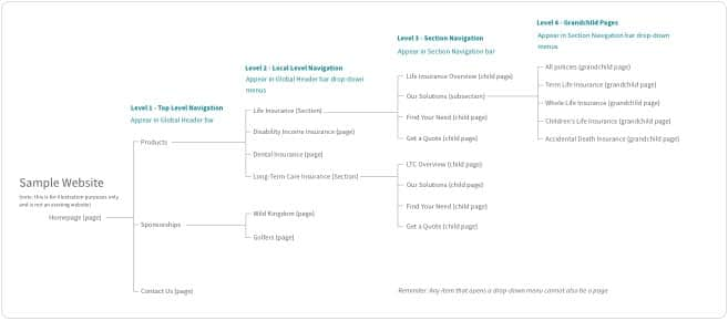
Top Level Navigation is the highest point in the site’s information architecture and is placed in the Global Header bar. The Top Level Navigation always remains consistent, even if a user has navigated deeper into a site’s structure.
A site with only one level of navigation would not use a mega menu. See the Standard Navigation pattern documentation for information on how to create a single level navigation site.
Helpful hints
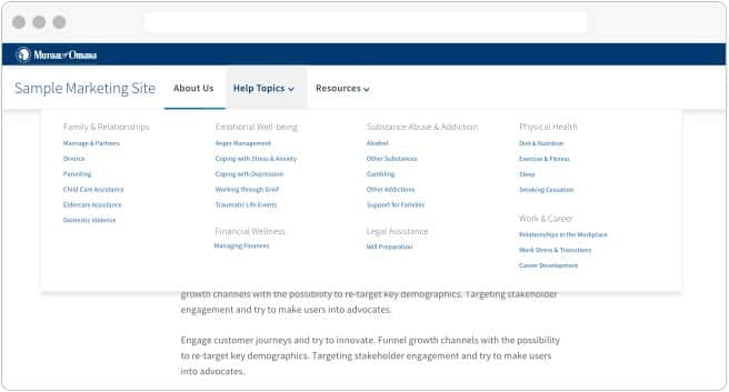
Local Level Navigation makes up the second level of the information architecture. This level includes everything that appears in the mega menu panel including Group Labels, Sections, and pages.
Group Labels appear at the top of each cluster of navigation items in the mega menu. They are not clickable, nor do they appear anywhere on subsequent pages. Their purpose is to help divide up a long list of navigation items into chunks so users can scan the menu quickly.
A Section is any item in the mega menu that has pages below it in the information architecture. See more about Sections below.
A page is a link in a mega menu that goes directly to a page and has no child pages below it in the information architecture.
To meet ADA requirements, the mega menu must open on-click, not on-hover. This means that any Top Level Navigation item with pages below it cannot also be a page. These instead act as a label for the Local Level Navigation pages that are exposed in the mega menu.
If there is a mix of Top Level Navigation items that go directly to a page and items that open the mega menu, use a caret to indicate the difference in functionality. If the styles are not mixed, no caret is necessary.
Helpful hints
Organizing the mega menu
Divide navigational items into Groups, keeping a medium level of granularity. Don't offer extremely long lists of options that require extensive time to scan. Conversely, don't make the individual groups so small that the mega menu panel has an overabundance of Group Labels with only one or two options under each.
Create a concise, yet descriptive label for each group. Enhance scannability by starting with the most information-carrying word. Avoid made-up terms and jargon.
Order groups in a meaningful sequence. Options include ordering by an inherent progress (ex: steps or a workflow), by most important, or by most frequently used. Keep in mind how the groups will visually sit in the mega menu panel – all groups should be visible in the mega menu at once without scrolling.
Helpful hints

Visual design options
Column layout
Mega menus are flexible in their column layout on larger screen sizes. Depending on the number of navigation items, the panel can hold three to five columns. When designing a panel layout, consider how the text will wrap at each breakpoint, and whether your navigation items will still be readable as the columns compress. Groups should always wrap to a new column together - don’t break a single group into multiple columns.
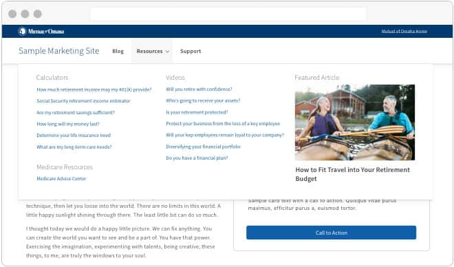
Featured content
Content can be featured on the right side of the mega menu panel on larger screen sizes. Images and text can be used to call out a feature that relates to the current mega menu panel. All images and text should follow our brand standards.
Note that featured content is only shown on larger screens and will not appear on mobile and other small-screen devices.
Section overview
As a site’s architecture stretches to 3 or 4 levels deep, Sections begin to play a role in its structure. A Section is any Local Level Navigation item (level 2 in the information architecture) with pages below it. Pages and Sections are styled identically in the mega menu.
When a Section is selected from the mega menu, the user is navigated to the first child page of the Section.
If there are fewer than 3 levels of navigation Section titles and Section Navigation are not used.
Helpful hints

Section titles
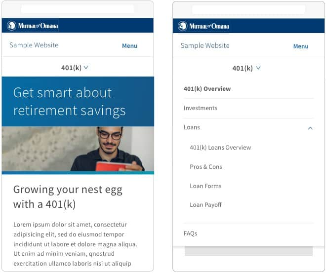
The Section Title should mirror its label in the mega menu. On large screen devices, the Section Title is placed on the top of the page below the Top Level Navigation and above the Section Navigation bar. On mobile and small screen devices, the Section Title houses the Section Navigation in a drop-down menu.

The section navigation bar
The third level of information architecture appears in the Section Navigation bar, directly under the Section Title. On mobile devices, the Section Navigation moves into the Section Title’s drop-down menu.
On large screen devices, the Section Navigation bar can house a call to action. This call to action should be moved to either the page content or to another area of the screen on small and mobile devices.
Child pages & subsections
Section Navigation bar items can be either pages - Child pages - or subsections with pages below them. Similar to the Top Level Navigation, any Section Navigation item that has pages below it cannot be a page itself, and acts as a subsection label.
The Section Navigation bar is persistent, and does not change if the user navigates deeper into a subnavigation drop-down menu. It only changes if the user moves to a completely different Section.
Level 4 - grandchild pages
The fourth level is the lowest tier of navigation supported in the mega menu Navigation pattern’s information architecture. All items in this level are considered “grandchild pages” and cannot have any pages below them. Grandchild pages are located in a Section Navigation drop-down menu.
Helpful hints

The lowest level of navigation available remains sticky upon scroll. Upon scrolling up, the other levels become visible with the exception of the blue Universal Corporate Header Bar.
The Universal Corporate bar does not become sticky unless it has frequently used links or other imporant features in it.