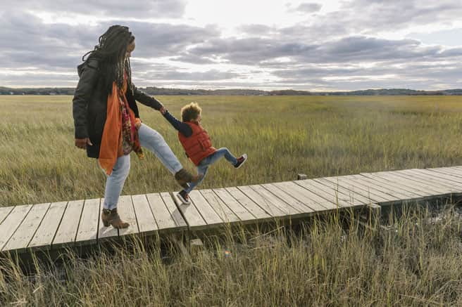
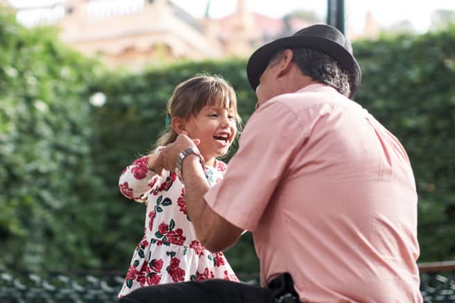
natural | personal | warm | optimistic
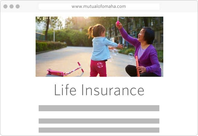
Mutual of Omaha has a history of helping people protect what’s most important to them. Our photography should represent the people, places and stories of our customers. Photos should be purposeful, driven by content and used to reinforce a concept or idea. They can be close-up, detailed shots or scenes captured from a distance.

authentic | journalistic | unstaged
Our photography should depict candid moments as people go about their lives. That means they should be interacting with others instead of looking directly into the camera. Photos can have a narrow depth of field, and should be well lit. But most importantly, they should tell a story. To reinforce this, images should be captured naturally without the use of filters.
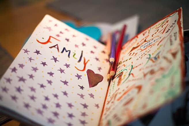
There are times when a photo without people is the best option. In these cases, the photo should still look authentic, unstaged and feel like it is part of a narrative.

confident | comfortable | approachable | diverse
Our customers are honest and hardworking, the middle-class backbone of America. Family keeps them grounded. So, our photography should evoke the feeling of family in an emotional and impactful way. Subjects should appear to be real people enjoying life – friends, family members, neighbors – and should embrace diversity and respect individuality.


Alt tags
Use Alt tags for images that have significance and add meaning to the content. Screen readers will output alt text with the rest of the page. Decorative images should use alt="" so screen readers don't read the fallback information about the image, such as the src attribute.
Image optimization
Optimize images for use on the web to minimize load time for users. All images on a page should be collectively less than 1mb in file size. Save images as closely to their final display size as possible. When a large image is required, save the graphic in different sizes, then use media queries to show the version of that fits each display size. Use lazy-loading techniques to give the user a sense of progress.
Hero photos
Large, dominant photos, frequently span the full width of the body
- Because hero images are so large, save different sized versions of the image and display the correct size based on media queries
- Do not use more than 1 hero photo per page
Spot photos
Contained images that are either rectangular or cropped to a circle.
- Minimum of 24px surrounding white space
- The larger the spot photo, the larger the surrounding white space should be
- No larger than 550px wide or tall in size on a Large screen device
Thumbnails
Small images that link to a file or larger version of the image.
- If cropping is required, show the most meaningful part of the image.
- Minimum of 24px of surrounding white space
Portraits & avatars
- User profiles and avatars are contained in a circle
- Portraits are contained in either a circle or a rectangle
- Avatars should have a minimum 8px of space surrounding them
- Portraits should have a minimum of 16px of space surrounding them.
Within a circle or as a stand alone image, spot illustrations can add understanding to a section of content on a page.
- Background circle is gray #e9e9e9
- Typically between 100px-300px on large screen

Detailed illustrations are generally used as a hero or as an island between sections on a webpage and should be used only for digital. They are similar to spot illustrations, but with a few differences:
- Does not have a background shape or color
- Can be used in larger sizes
- Digital use only

Small line graphics that are meaningful to a small section of text or to an action.
- Single color
- Only use in corporate colors with ADA compliance
- 100px or smaller
- Have meaning that closely matches its related text/action
- Not used as a decoration
- Should have the same meaning every time it is used in a site or application. For example, if a book icon is used to link to a document library, do not use the same icon for downloading a book.